25 Perfect Wedding Color Schemes
Are you searching for Wedding color schemes, search no more you are in the right place.
We have curated 25 Unique Wedding color schemes you will love.
Choosing a wedding color scheme is one of the most exciting parts of the planning process.
It quietly shapes the entire atmosphere of the celebration, influencing everything from the first impression guests have when they walk in, to the memories captured in photographs for years to come.
Colors have a way of telling a story without words, setting a mood that reflects personality, style, and the kind of experience a couple wants to create.
Today’s weddings are no longer bound by tradition alone.
Couples are leaning into creativity, drawing inspiration from art, fashion, nature, culture, and even unexpected places.
This shift has opened the door to color combinations that feel fresh, expressive, and deeply personal, allowing each celebration to stand apart in its own beautiful way.
If you are searching for something beyond the familiar, you are in the right place.
25 Unique Wedding color schemes
1. Terracotta and Cream
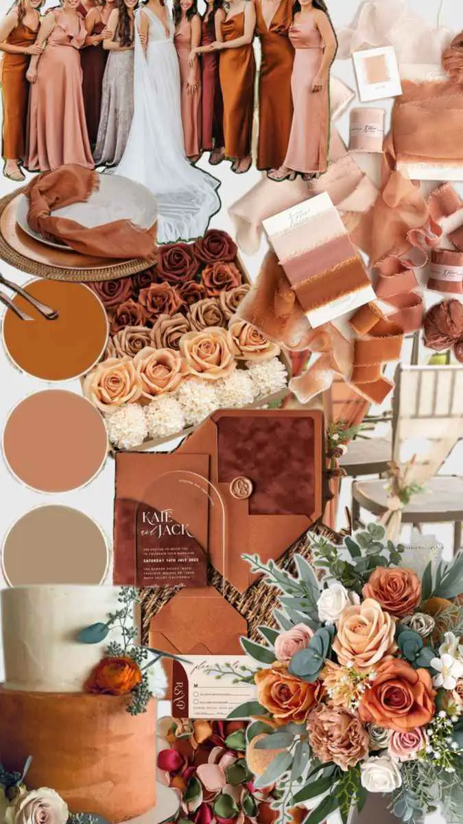
Terracotta and cream create a warm, grounded palette that feels both inviting and effortlessly elegant.
Terracotta brings an earthy richness that instantly adds depth to a space, while cream softens the overall look with a gentle, romantic touch.
Together, they strike a beautiful balance between rustic charm and refined sophistication.
This pairing works wonderfully in both indoor and outdoor settings because it mirrors natural tones often found in landscapes, pottery, and sunlit architecture.
Couples drawn to this palette often appreciate a relaxed yet stylish atmosphere, one that feels intimate without sacrificing visual impact.
2. Sage Green and Dusty Blue
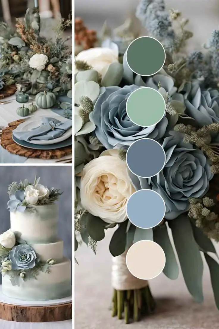
Sage green and dusty blue offer a calming combination that feels fresh without being overpowering.
Sage introduces a subtle hint of nature, evoking quiet gardens and peaceful scenery, while dusty blue contributes a muted elegance that keeps the palette looking polished.
The beauty of these colors lies in their softness, they complement each other rather than compete for attention.
This scheme is ideal for couples who want their wedding to feel serene, thoughtful, and timeless, creating an environment where guests can truly settle in and enjoy the moment.
3. Champagne and Soft Blush
Champagne and soft blush are perfect for couples seeking understated luxury.
Champagne carries a natural glow that feels celebratory without appearing flashy, and blush adds a whisper of romance that enhances the emotional tone of the day.
Together, they create a light filled atmosphere that photographs beautifully and never feels heavy.
This palette has a graceful quality that makes a celebration feel elevated while still remaining approachable and warm.
4. Emerald Green and Gold
Few combinations communicate elegance as effortlessly as emerald green and gold.
Emerald is rich and dramatic, instantly capturing attention with its jewel toned depth, while gold introduces a sense of grandeur and celebration.
The pairing feels intentional and confident, making it ideal for couples who want their wedding to leave a lasting impression.
Despite its boldness, the palette can feel surprisingly versatile, adapting well to both classic and contemporary aesthetics.
5. Lavender and Silver
Lavender and silver bring a dreamy, almost ethereal quality to a wedding atmosphere.
Lavender carries a gentle charm that feels romantic without becoming overly sweet, and silver adds a sleek brightness that enhances the overall look.
This combination works particularly well for couples who want a celebration that feels graceful and slightly whimsical.
The tones reflect light beautifully, helping create an environment that feels airy and memorable.
6. Burnt Orange and Navy
Burnt orange and navy form a striking contrast that feels modern yet grounded.
Burnt orange radiates warmth and personality, while navy provides structure and depth.
Together, they create visual interest that draws the eye without overwhelming it.
This palette is especially appealing for couples who want something distinctive but still sophisticated, proving that bold choices can remain tasteful when thoughtfully paired.
7. Peach and Mint
Peach and mint deliver a refreshing blend of warmth and coolness.
Peach brings a cheerful glow that feels welcoming, while mint offers a crisp brightness that keeps the palette lively.
The result is a combination that feels youthful, optimistic, and full of energy.
Couples who gravitate toward this scheme often want their celebration to feel joyful and relaxed, encouraging guests to share in the happiness of the day.
8. Burgundy and Mauve
Burgundy and mauve create a layered look that feels rich without being heavy.
Burgundy introduces intensity and passion, while mauve softens the palette with its quiet sophistication.
The two shades complement each other beautifully, forming a harmonious balance between drama and delicacy.
This scheme suits couples who appreciate depth and emotional warmth, offering a setting that feels both intimate and visually compelling.
9. Mustard Yellow and Charcoal
Mustard yellow paired with charcoal results in a palette that feels contemporary and confident.
Mustard adds personality with its golden undertone, while charcoal anchors the look with a refined edge.
The contrast keeps the aesthetic interesting and prevents the brightness from becoming overwhelming.
Couples looking for something stylish yet approachable often find this pairing especially appealing.
10. Coral and Teal
Coral and teal create an energetic palette that feels vibrant without losing elegance.
Coral radiates positivity and warmth, while teal introduces a cool richness that balances the brightness.
Together, they form a dynamic duo that captures attention in a natural way.
This scheme is perfect for couples who want their wedding to feel lively, expressive, and full of character.
11. Ice Blue and White
Ice blue and white evoke a sense of purity and calm.
Ice blue carries a delicate coolness that feels refreshing, and white enhances the palette with its timeless simplicity.
The result is an atmosphere that feels clean, open, and effortlessly graceful.
Couples drawn to this combination often appreciate its quiet beauty and enduring appeal.
12. Plum and Rose Gold
Plum and rose gold deliver a romantic palette with a modern twist.
Plum offers depth and a touch of mystery, while rose gold contributes warmth and a subtle glow.
The pairing feels luxurious without appearing excessive, creating a refined environment that still feels welcoming.
It is an excellent choice for couples who want elegance with personality.
13. Forest Green and Ivory
Forest green and ivory reflect the beauty of nature in a refined way.
Forest green provides richness and stability, while ivory softens the look with gentle warmth.
Together, they create a palette that feels grounded, peaceful, and timeless.
This combination resonates with couples who value authenticity and want their celebration to feel meaningful rather than overly elaborate.
14. Raspberry and Champagne
Raspberry and champagne form a lively yet polished pairing.
Raspberry introduces a burst of color that feels joyful and confident, while champagne keeps the overall look sophisticated.
The contrast between vibrant and subtle tones adds dimension without creating visual chaos.
It is a wonderful option for couples who want their wedding to feel festive yet elegant.
15. Powder Blue and Taupe
Powder blue and taupe offer a refined neutrality that feels both modern and enduring.
Powder blue brings softness and lightness, while taupe grounds the palette with quiet strength.
This combination creates a balanced atmosphere that never feels overwhelming.
Couples who prefer subtle beauty often gravitate toward this scheme because it allows every detail to shine without competing for attention.
16. Copper and Sage
Copper and sage blend warmth with natural tranquility.
Copper carries a gentle shimmer that feels inviting rather than flashy, and sage contributes an organic calmness.
The pairing feels thoughtful and current, appealing to couples who appreciate design that is both stylish and comfortable.
17. Lilac and Butter Yellow
Lilac and butter yellow create a cheerful palette that still feels refined.
Lilac offers a soft romantic presence, while butter yellow adds a delicate brightness that lifts the entire atmosphere.
Together, they suggest optimism and new beginnings, making them especially fitting for a celebration centered on love and hope.
18. Midnight Blue and Pearl
Midnight blue and pearl bring drama and softness into perfect harmony.
Midnight blue adds depth that feels almost cinematic, while pearl introduces a luminous quality that keeps the palette from feeling too dark.
This combination is ideal for couples who want a memorable aesthetic that feels both bold and graceful.
19. Olive and Sand
Olive and sand create a relaxed, nature inspired palette that feels effortlessly beautiful.
Olive provides muted richness, and sand contributes a light neutrality that enhances the overall calm.
The scheme feels organic and welcoming, perfect for couples who want their wedding to feel comfortable and sincere.
20. Fuchsia and Slate
Fuchsia and slate offer a modern contrast that feels energetic yet controlled.
Fuchsia commands attention with its vibrancy, while slate tempers that intensity with cool sophistication.
The balance ensures the palette remains stylish rather than overwhelming, appealing to couples who enjoy standing out in a tasteful way.
21. Apricot and Dove Gray
Apricot and dove gray combine warmth and subtlety in a way that feels refreshingly different.
Apricot glows with gentle optimism, and dove gray provides a smooth, contemporary backdrop.
Together, they form a palette that feels approachable, refined, and quietly memorable.
22. Chocolate Brown and Blush
Chocolate brown and blush create a comforting blend of richness and romance.
Brown introduces stability and depth, while blush softens the look with tenderness.
The pairing feels intimate and heartfelt, making it perfect for couples who want their celebration to emphasize connection and warmth.
23. Turquoise and Coral Pink
Turquoise and coral pink radiate personality and charm.
Turquoise brings brightness reminiscent of clear waters, while coral pink enhances the palette with playful warmth.
The result is lively without being chaotic, ideal for couples who want a joyful atmosphere that guests will remember.
24. Steel Blue and Marigold
Steel blue and marigold form a striking partnership that feels both artistic and balanced.
Steel blue offers a calm, steady presence, while marigold energizes the palette with golden vibrancy.
This contrast creates visual intrigue while maintaining harmony, making it a strong choice for couples seeking something distinctive.
25. Soft Gray and Pale Pink
Soft gray and pale pink prove that subtle colors can still make a powerful impression.
Gray provides a modern foundation, and pale pink layers in quiet romance.
The combination feels gentle, elegant, and enduring, ensuring the celebration remains visually beautiful without relying on bold statements.
Couples who appreciate simplicity often find this palette especially appealing because it allows emotion and atmosphere to take center stage.
A wedding color scheme is more than a visual choice, it is the thread that quietly ties every moment of the celebration together.
From the atmosphere guests step into, to the lasting impressions carried home long after the day is over, the right palette has the power to transform a beautiful event into an unforgettable experience.
It reflects personality, sets the emotional tone, and helps tell a love story in a way that feels both intentional and deeply personal.
As you explore these unique color combinations, remember that there is no single formula for perfection.
The most memorable weddings are not defined by trends, but by authenticity.
Choosing colors that resonate with your style and vision allows your celebration to feel natural rather than staged, creating a space where every detail works in harmony.
Let these ideas inspire you to think beyond the expected and embrace a palette that truly speaks to you.
When your colors feel right, everything else tends to fall into place, resulting in a wedding that is not only visually stunning but also meaningful, welcoming, and unmistakably yours.
Leave a Reply